Hey there! Welcome to the House Designer blog, where transforming homes into personal havens is our passion. We’re a team of creative interior designers based in London, and we’re obsessed with everything home décor. Today, we’re diving into the fascinating world of colours and how they play with our minds—in the best possible way!
Understanding the Impact of Colour in Interior Design

image credit: House Designer
Did you know that the colours in your home can influence your mood? It’s true! Just like how you can’t resist a bag of crisps at midnight, colours have a way of getting under your skin. Let’s break down how different colours affect our emotions and how you can use them to create a home that feels just right.
The Calming Effect of Blue
Blue is like that best friend who always knows how to calm you down. It’s perfect for bedrooms and bathrooms where you want to unwind after a long day of pretending to work. Light shades of blue can make a room feel airy and spacious, while darker blues add a touch of sophistication. Got a home office? Splash some blue around to help you focus – or at least pretend you’re focusing.
Recommended Paint Brands:
- Farrow & Ball: “Borrowed Light” for a soft blue.
- Dulux: “Mineral Mist” for a gentle, calming shade.
- Little Greene: “Air Force Blue” for a more intense, rich blue.
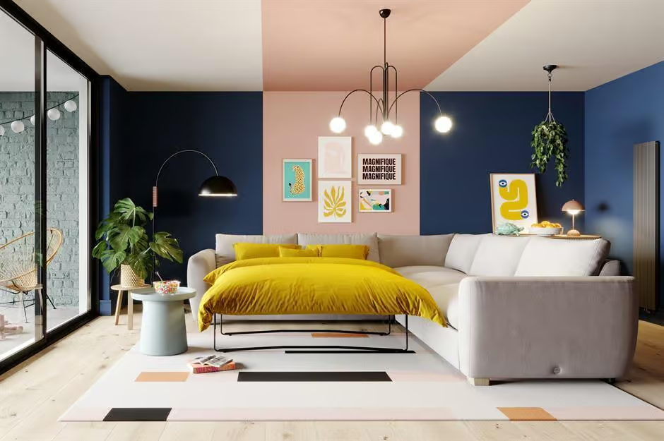
The Energising Power of Yellow

image credit: House Designer
Yellow is like a double shot of espresso in colour form. It brings warmth and happiness to a space, making it perfect for kitchens and dining areas. Just don’t go overboard – too much yellow and you might start feeling like you’re living inside a highlighter. Use it as an accent colour to keep things cheerful but not overwhelming.

image credit: House Designer
Recommended Paint Brands:
- Farrow & Ball: “Citron” for a bold statement.
- Dulux: “Sundance” for a bright, cheerful shade.
- Crown: “Lemon Squash” for a softer yellow.
The Invigorating Nature of Green

Green is nature’s way of telling us to chill out. It’s great for living rooms and bedrooms, promoting relaxation and rejuvenation. Plus, green is known to boost creativity, so it’s perfect for home offices or creative spaces. Whether you go for a soft sage or a vibrant emerald, green can make any room feel fresh and inviting.
Recommended Paint Brands:
- Farrow & Ball: “Breakfast Room Green” for a fresh, inviting look.
- Dulux: “Willow Tree” for a soft, calming green.
- Little Greene: “Sage Green” for a classic, timeless shade.
The Passion of Red

Red is like the life of the party – bold, dynamic, and always making a statement. It’s great for dining rooms and living spaces, adding energy and excitement. Just remember, a little red goes a long way. Think of it like hot sauce – a few dashes can spice things up, but too much and you’re in trouble.
Recommended Paint Brands:
- Farrow & Ball: “Rectory Red” for a deep, warm red.
- Dulux: “Redcurrant Glory” for a vibrant, energising hue.
- Crown: “Exotic Spice” for a rich, earthy red.
The Elegance of Purple
Purple is the colour of royalty – and who wouldn’t want to feel like a king or queen in their own home? Light purples like lavender bring a soft, romantic feel to bedrooms, while deeper shades like plum add drama and depth to living spaces. Purple can even glam up your bathroom or dressing area, because why not feel fabulous everywhere?
Recommended Paint Brands:
- Farrow & Ball: “Brassica” for a soft, sophisticated purple.
- Dulux: “Amethyst Starling” for a rich, deep shade.
- Crown: “Purple Pout” for a bold, dramatic look.
The Balance of Neutrals
 Neutrals are like the Switzerland of colours – calm, reliable, and get along with everyone. They make a perfect backdrop for any design style and let other colours shine. Neutrals are great for making spaces feel open and airy, especially in living rooms and kitchens. Plus, they never go out of style, so you won’t feel the need to repaint every year.
Recommended Paint Brands:
- Farrow & Ball: “All White” for a crisp, pure white.
- Dulux: “Timeless” for a warm, inviting white.
- Little Greene: “French Grey” for a soft, elegant grey.
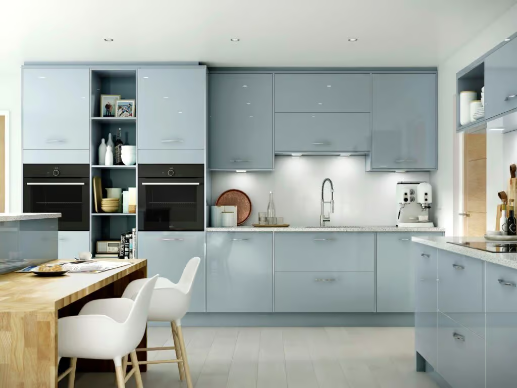
The Best Colour for Small Spaces
 When it comes to small spaces, light colours are your best friend. They reflect more light, making the room feel bigger and brighter. Whites, soft greys, and light blues are particularly effective. These colours create a sense of openness and airiness, giving the illusion of a larger space. Here are some top picks:
Recommended Paint Brands:
- Farrow & Ball: “Skimming Stone” for a warm, light grey.
- Dulux: “White Mist” for a crisp, clean white.
- Little Greene: “Celia” for a light, fresh blue.
Using Colour to Create Zones in Open Plan Spaces

image credit: Taylor Wimpey
In open plan spaces, colours can help you define different zones and create a sense of order. Use different shades of the same colour to distinguish areas like the kitchen and dining room, or a bold accent to highlight a reading nook. This trick not only adds visual interest but also makes the space more functional.
Recommended Paint Brands:
- Farrow & Ball: “Pavilion Gray” for subtle zoning.
- Dulux: “Pepper Red” for bold accents.
- Crown: “Mustard Jar” for vibrant touches.
Practical Tips for Choosing Colours

- Consider the Room’s Function: Think about how you use the room and what atmosphere you want to create. Calming colours like blue and green are great for relaxing spaces, while energising colours like yellow and red are perfect for active areas.
- Test Before You Commit: Always test paint colours on a small area before committing. Colours can look different depending on the lighting and other elements in the room.
- Use a Colour Wheel: A colour wheel helps you understand how different colours relate to each other. Complementary colours create a vibrant look, while analogous colours provide a more harmonious feel.
- Balance Bold Colours with Neutrals: Use bold colours sparingly and balance them with neutrals to avoid overwhelming the space.
- Consider the Lighting: Both natural and artificial lighting affect how colours appear. Choose colours that look good in all types of light.
The Importance of Colour in Home Design

image credit: Harvey Jones
At House Designer, we believe colour is a powerful tool for creating beautiful and functional spaces. Whether you’re looking to refresh a single room or redesign your entire home, understanding the psychology of colour can help you make choices that enhance your living environment.
Ready to transform your home with the perfect colours? Contact House Designer today to learn more about our affordable interior design packages. Let’s create a space that reflects your personality and meets your needs.